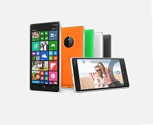
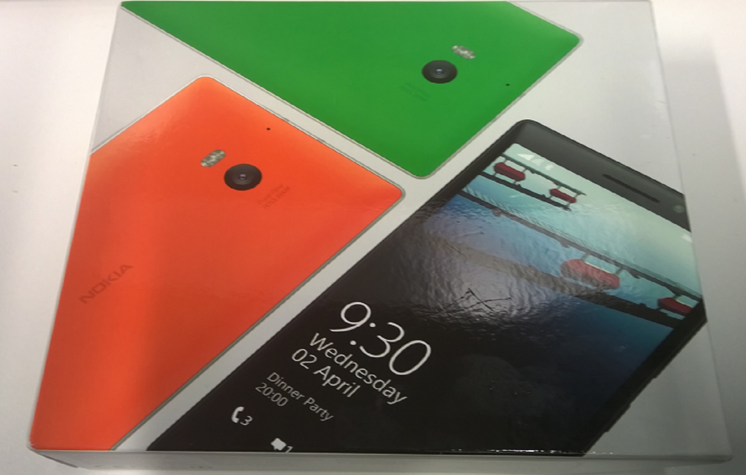
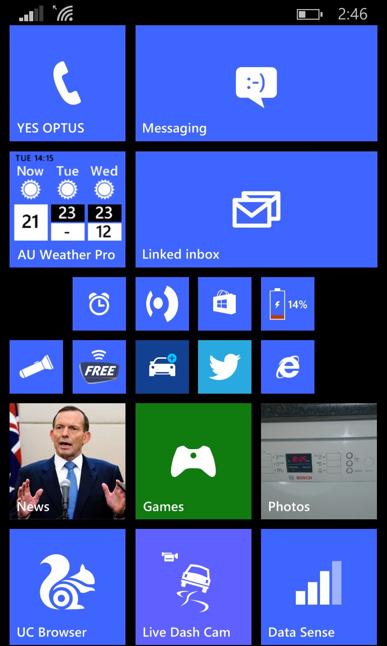
Microsoft have provided me with a new Nokia Lumia 830 to roadtest, so I was keen to compare it against the current flagship model – the Nokia Lumia 930. The 830 is a mid-range phone though, so there are many differences between the two. I reviewed the Lumia 930 a few months ago, so we’ll cover the 830 mostly with some comparisons to the 930. OS The Lumia 830 is one the first phones to ship with Lumia Demin, following on from the Lumia Cyan release (they go up alphabetically, like Ubuntu releases). Microsoft list the features here, and there’s a few nice additions. For Australians such as myself, along with Canadians and Indians, we have alpha Cortana support. I’ve started to test this, and speech recognition is definitely better than it was previously. The other more important benefits relate to certain Lumia phones only, which mostly focus on camera improvements, as well as features for the glance screen. Screen Yes, the glance screen is back! This was one of the biggest features missing from the Lumia 930, but due to the 830 using an LCD screen rather than the 930’s OLED. Grabbing your phone out your pocket and just looking at it to know the date/time along with a second piece of information is simple but efficient. I’d like to see more options around this – I don’t like choosing between weather OR my next meeting, I’d like to see both. Hopefully as glance screen matures, it will become even more customisable. Despite both phones having a 5 inch screen, resolution wise, the 830 runs at 720 x 1280, which is much lower than the 930’s 1080 x 1920. I couldn’t visibly tell the difference in general day to day use, so although more...
Review: Nokia Lumia 930
posted by Adam Fowler
Thanks to Nokia Australia, I was given a new Nokia Lumia 930 to try out. It’s Nokia’s latest flagship Windows Phone running Windows Phone 8.1 straight out of the box, and it’s running on some pretty nice hardware. Here’s my thoughts on it: (also I have to give the phone back at the end of an 8 week trial, so I wonder if they’ll fall for the original phone box full of sand trick?) For some history, I’ve used all of Nokia’s flagship WP8 devices being the Nokia Lumia 1520, 1020 and 920 (I think that’s all of them). So, how does the 930 compare to the previous models, and if you have one should you upgrade? Screen Skipping the Windows Phone 8.1 side of things (as I’ve talked about this previously), the 930 at first glance seems to be a pretty looking phone. The screen is 5″ 1080p which after trying the 4.5″ 1020 and the 6″ 1520, I think the 930 is the sweet spot for a smart phone display. It’s not so big that you have to wear pants with big pockets, and not so small that basic web browsing requires excessive amounts of pinching and zooming. The screen seems a bit glossier than others, I’ve noticed light reflections. It also has a bit of a curve near the borders which isn’t off putting when using the phone, but noticeable when the screen is off. The screen itself shows vibrant colours while seeming very clear to me. One drawback of the 930 is that they’ve dropped Glance. This gave you simple information such as the time and your last email, even when the screen was in standby mode. It meant you could check to see if you had any messages without pressing anything, just a glance...
Windows Phone 8.1 Is Out!
posted by Adam Fowler
The Windows Phone 8.1 OS update is now available to ‘Developers’. In this case, a developer is anyone who downloads and briefly sets up the Preview for Developers app and then runs a phone update. This is actually a decent way to let people who are happy to play with an update do so, before released to the general public. The upgrade process isn’t very exciting, but can take a while. On my Nokia Lumia 1020, there was a small 2mb update which took about 10 minutes to install, before the big 8.1 (of unknown size) update which took about 25 minutes. A very smooth process but don’t do this when you’re expecting a call. After upgrading I had a headache, but that was unrelated. Overcoming this, I was looking at a phone that had many obvious improvements. 8.1 is a BIG update, and here’s some of the more interesting bits I found: Screenshots – The button combination used to be Power and Start, but it’s now Power and Volume Up. They nicely tell you this when you try to take your first screenshot (say if you were writing an article): Notification Center – Yes, Microsoft has followed Apple who followed Google. I see this as a standard requirement for a smart phone now, and this notification screen gives you enough information. Yes, mine’s a bit blank but it shows you unread emails, SMSes and so on. It also can take you to the settings page, which for me means one less tile on the start screen. Another handy part of the Notification Center is the ability to turn screen rotation on and off. Now you can control it once you’re in an app, as I usually have it off for lying in bed where gravity...


