Microsoft Band: the verdict is in
Working wearable, room for improvement
Being a very unfit kind of guy I decided it was time to perhaps take a look at getting myself that bit  thinner. I decided to try the new Microsoft Band activity tracker and see what it had to offer, it being one of the new kids on the block. The Microsoft band is actually about more than just fitness.
When it came to unboxing and setting it up, there were a few surprises. Firstly, the fact that it doesn’t interface with your PC, at all.
Setup pretty much consists of installing the Microsoft Health app from the store for the relevant mobile phone and then follow the on phone setup wizard. I was using an Android phone using Lollipop and it worked fine, setting up a Bluetooth pairing without issue. Unfortunately, it won’t let you bypass putting your weight in or the requirement of having a Microsoft account.
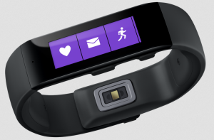
If you are using a Fitbit or similar, the first thing you will notice is the weight and the size of the band. It is noticeably heavier than the Fitbit, as well as more expensive. It does however have a nice things that put it on the right side of useful but without being boring, including the big bright screen and the ability to see emails and messages come in with a gentle buzz on your wrist.
This feature is really handy if you are like me and have your phone on silent frequently. It will discretely buzz and flash the email subject. It is just a pity that you can’t read the entire email should you choose to do so.
In general the band feels really well put together and the sliding clasp type holder is unique. It just oozes quality construction. The magnetic power charger idea just adds to that reputation and is an easy clip on to power and pull off when your finished type of affair. The only odd bit I found was that the charger isn’t quite universal in the way it clips on. If put “upside down” it won’t charge.
I have to say .. It’s good. The actual phone application itself looks really well put together . It flows as it should, scrolls as it should and in general is good. You use the app on your phone to do everything, change the band color, the background, what is displayed, tile icons, the lot.
In day to day use it works well and it works with multiple email addresses assuming they are setup on your phone beforehand. It’s all dictated by whats on your phone. The only negative aspect around the email feature is that you can only read the title of the email, and not the entire email. At that point it is phone out time, which is kind of annoying.
When used with an Android device the audio control won’t work. To use this a Windows mobile is required. With Android and Iphone the device becomes mostly a consumption only type of affair.
The health features work as expected and appear to be quite accurate with the limited testing done. As with any device of this type it comes with downloadable workouts and such that are designed to promote exercise. One other oddity I found was in the sleep tracking side of the device.
Whilst every other device on the market appears to be able to automatically tell when you’re asleep or not, the Microsoft Band requires you to tell it when you’re going to sleep. The latest device release notes say that this should no longer be an issue, but as of this writing the firmware mentioned wasn’t available to me in the UK.
Overall, it is a very nice device but it does come with a few nigles as mentioned. You would expect a few with any new product being released to market. It does, however, to my mind feel that the ecosystem around the device is still very much in the building stages.
Also some of the apps are a bit … “sponsored” for want of a better term with the “Locate Starbucks” app built into the band. Personally, I am a Costa kind of guy but I suspect it will be a cold day in hell before you see a Costa app on the band.
- Microsoft Band: the verdict is in - November 7, 2015
- HP ML310e Review - May 22, 2013


